Long Walks at the Airport
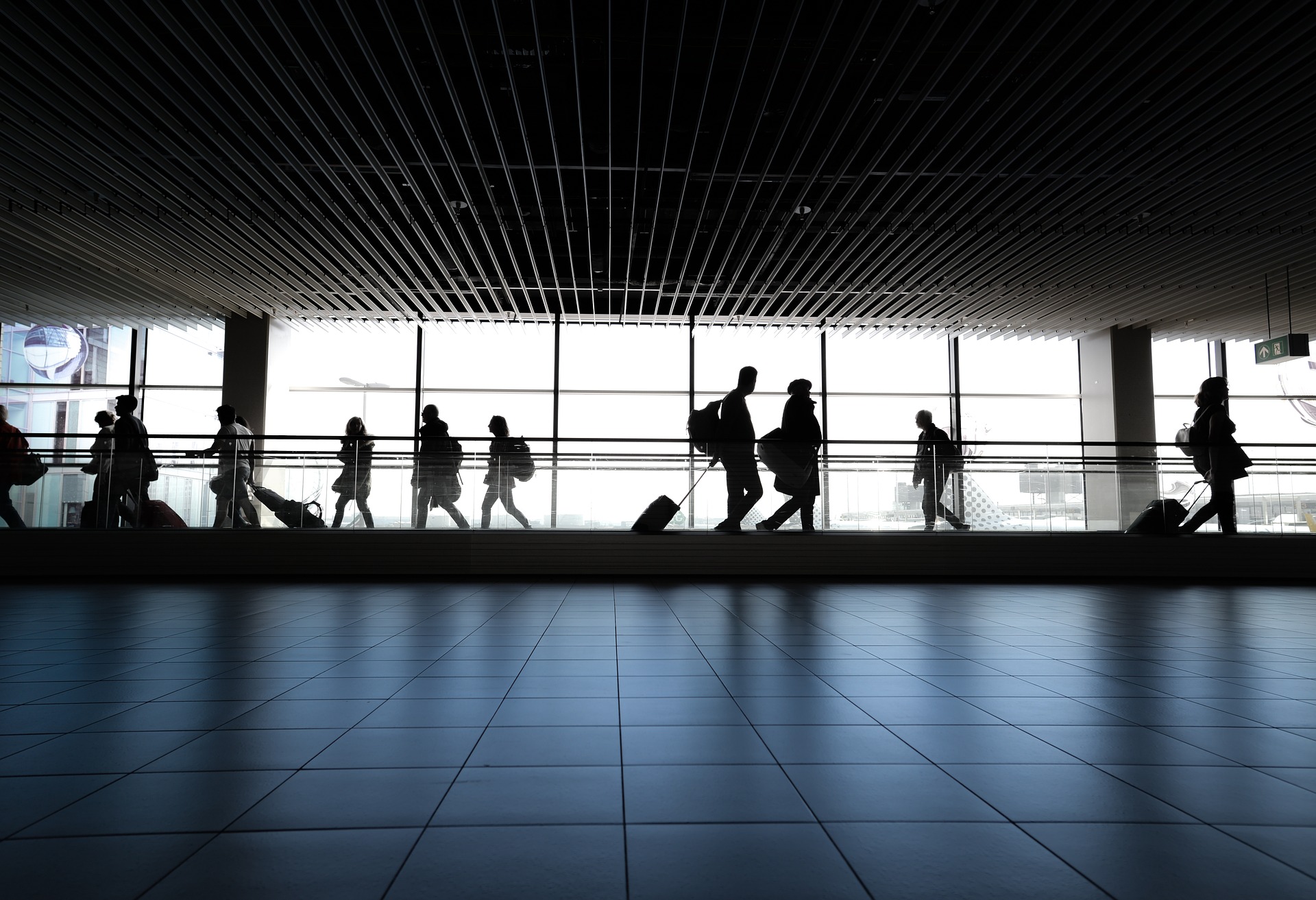
Terminal B of the Salt Lake City airport is unique among the airport terminals I’ve been to. Perhaps as an homage to Utah’s love of nature, this destination features a mile-long scenic hike from the gate to the airport exit. And no, it’s not optional.
But it’s not just the Salt Lake City airport that does this. Which leads us to a broader question: why do we spend so much time walking to the gate at airports?
The answer to this question lies in access patterns. In software design, access patterns are the queries people make on a given set of data. For a social media app, the most frequent access patterns might include the following:
- Given a user, fetch a list of their followers
- Given a user, fetch a list of their posts
- Given a search query (”Jane”), fetch a list of users matching the query
- Given a user’s contacts, determine which ones are already using the app
For software developers, access patterns are important for designing data models and backend infrastructure. Following this train of thought, I started wondering: what are the access patterns determining the design of the Salt Lake City (SLC) airport?
SLC Airport - Access Patterns
Here’s what I came up with initially:
- Passengers arriving
- Passengers departing
Pretty straightforward so far. But then I realized there were more access patterns, with each representing different stakeholders:
- Planes arriving
- Planes departing
- Cars picking up passengers
- Cars dropping off passengers
- Cars parking at the airport
- Planes parking at the airport
While there might be other access patterns for an airport, these seem to be the most frequent. Given these access patterns, the next logical question was: what access patterns is this airport optimized for?
SLC Airport - Design
As I learned firsthand, passengers departing from terminal B have to make the same mile-long trek as when they arrived. Notwithstanding the benefits of 20 minutes of light-intensity exercise, this airport is clearly not optimized for passengers.
If not passengers, who is the airport designed for? Planes, apparently. The SLC airfield follows a big H shape, which works quite nicely for plane taxiing and parking. The shape of the H maximizes the number of runways while making it easy to service each, and therefore is optimized for planes taking off and landing. Here’s a map from the SLC airport website:
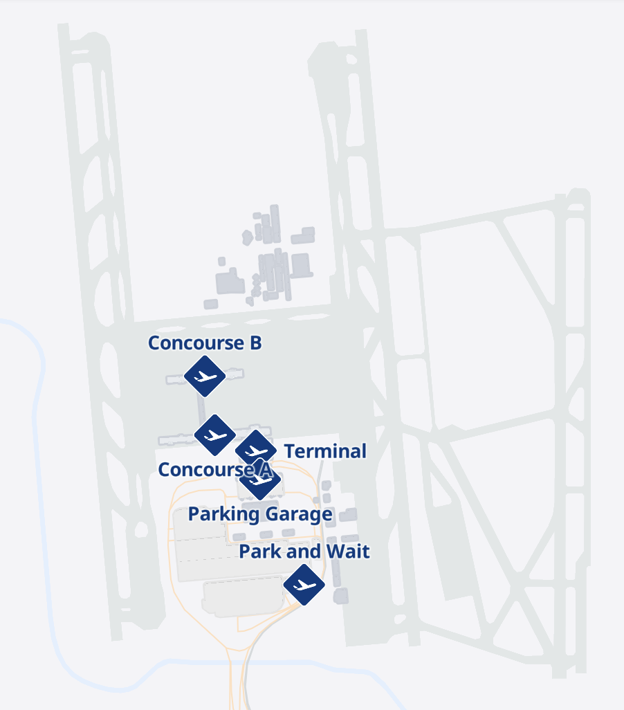
The bottom half of the H contains a large looping road, allowing easy access for cars picking up, dropping off, and parking at the airport.
Just like that, we’ve optimized the airport for all of our access patterns! Except, of course, for passengers walking to their terminal. Here’s what the walkable portion of the airport looks like:
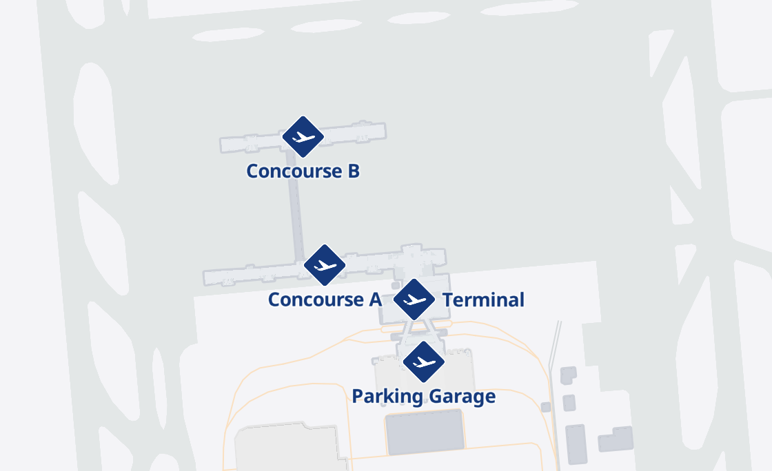
The walkable portion of the SLC airport: a neat little sideways H nestled inside the larger H of the airfield. Aesthetic but ultimately suboptimal.
Here’s where the access patterns truly come into conflict:
For the planes, the airport is most useful when the surface area of the two concourses is maximized (via the sideways H structure), because that’s what maximizes plane parking. Meanwhile, cars arriving at the airport are channeled into a centralized entry point (labelled “Terminal” on the map), which is relatively convenient.
So planes and cars are satisfied. However, thanks to these constraints, pedestrians must enter from a single entry point and traverse the full surface-area-maximizing H shape — including the half-mile tunnel between Concourses A and B — in order to reach their desired destination, which is Concourse B (aka Terminal B).
The Salt Lake City airport is a case study in how, when access patterns for different stakeholders come into conflict, not everyone wins. As in pickup frisbee games, the winners stay and the losers walk. But are there any airports that manage to solve this conflict successfully?
Case in point: the DFW International Airport.
DFW Airport - Design
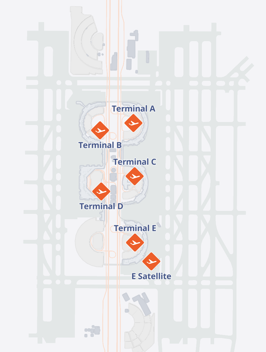
The DFW International Airport: a masterpiece of optimized access patterns. Roads are highlighted in orange.
As with the SLC Airport, the DFW Airport features an H-shaped airfield that maximizes runway space. However, the airport building itself is designed instead as a set of independent semicircles. When cars arrive at the airport, they can drive into the loop of a semicircle (say, Terminal C) and pick up or drop off passengers directly at a point on its inner edge. Once passengers pass through the security checkpoint, they’ve basically arrived at their gate.
So passengers and cars are both satisfied. What about planes? Thanks to its semicircular subunits, the airport provides optimal external surface area for planes to dock at each gate. Just as in the SLC airport, planes receive plenty of space for parking at the gate.
But what if passengers want to travel between gates? While this is a bit of an edge case, it’s certainly a common one. For example, some passengers might need to transfer between flights. Fortunately, these passengers can take the Skylink, which is a tram that connects all of the terminals.
One additional bonus of the DFW Airport’s structure is its scalability. If the airport so decides, they could easily add any number of new terminals to the north or south of its existing terminals without affecting access times for passengers, cars, or planes.
Meanwhile, Salt Lake City would have to add another half-mile tunnel.
As the DFW Airport demonstrates, walking at the airport is not an inevitability. Whether due to space constraints, budget constraints, or simply close-mindedness, airports often make life difficult for passengers walking to and from their gates, especially when said passengers are running late. But it doesn’t have to be that way.
Perhaps, by accounting for all the important access patterns, we’ll finally be able to just visit the airport and board the plane, without the mandatory half-hour cardio session on the way to the gate.